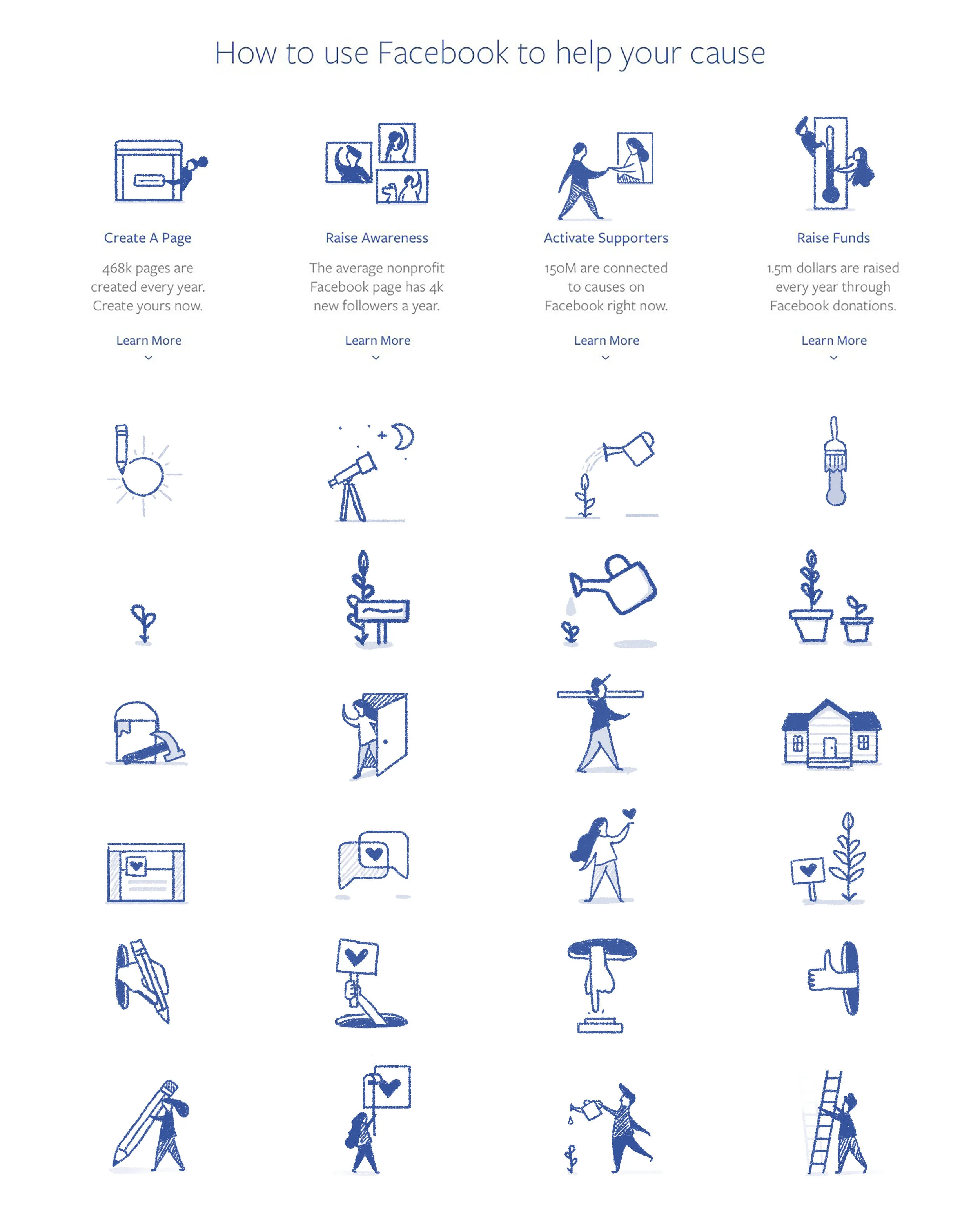
NONPROFITS ON FACEBOOK
While many people around the world are very familiar with how to use Facebook for their own accounts, there are other specific use cases that have functionally and conceptually different needs than a personal account. Upperquad was working on ways to guide Nonprofits to some best practices in leveraging the Facebook platform to achieve their foundational goals and approached me for some help illustrating some of the core concepts.
step 1: Concept sketches
The first phase of any project for me is always sketching, picking up a pen (either analog or digital) and just working through ideas. This one required ideas that could work within a series for their primary use on the landing page of the site they were building and also in a series across other contexts and placements throughout secondary and tertiary content.
step 2: STYLE DEVELOPMENT
We also worked through a range of visual style explorations in order to determine how to best visually depict the tone they were taking with their audience. We tried cut paper, soft textures, pen sketches and flat color before landing on a style that was both friendly and precise.
step 3: ASSET CREATION
After establishing a style we developed concepts for the remaining implementations and crafted a series of illustrations depicting core scenarios and contexts relative to nonprofit organizations. The friendly proportions, soft color and subtle shadows added personality and depth while single red accent colors added both a compositional focus and element of consistency.


