UBER ICON SYSTEM
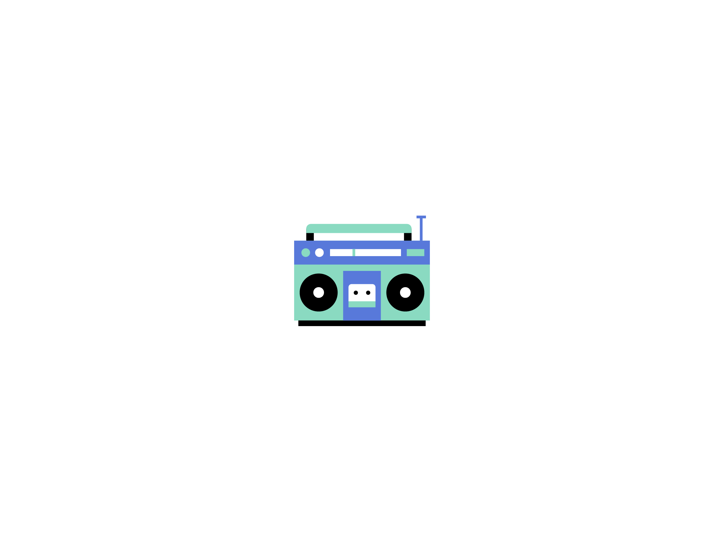
I was contacted by the brand illustration team at Uber to help them out with a wide variety of projects over a six month period. During that time one of the largest things we tackled was establishing a style for a set of icons called feature icons. While they had an established illustration style it did not translate well at all down to smaller sizes, there issues with consistency, legibility and even rendering performance on mobile devices. After solving these issues for them in a visual style that lined up well with the rest of the brand visual voice we built out a core set of icons across different themes like food, travel, holidays, music, etc.
BUILDING A STYLE
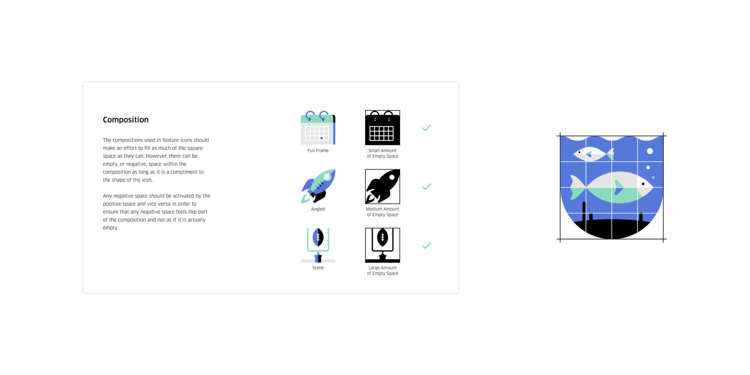
By using a limited color palette, a specific grid and plenty of rules we were able to craft a style that was easy to understand yet still very sophisticated. We used the color palette to create a modeled style of lighting, gave objects a realistic yet stylized appearance and crafted details built around the concept of the visuals rather than just adding aesthetic noise.
SMALL ICONS, LARGE IMPACT
After creating the initial set of 150+ icons I built out a guide that covered all of the conceptual and visual design principles that defined the set as a cohesive unit. The guide was distributed across the entire company so that the many Uber offices around the world were able to create their own feature icons for specific uses efficiently and effectively without having to worry about timing, correctly translating certain cultural nuances or needing approvals.
Of course I got to ignore the rules and make some fun stuff too!
I also did all of the drawings for the initial launch of driver compliment stickers.
