

YELP Product illustrations
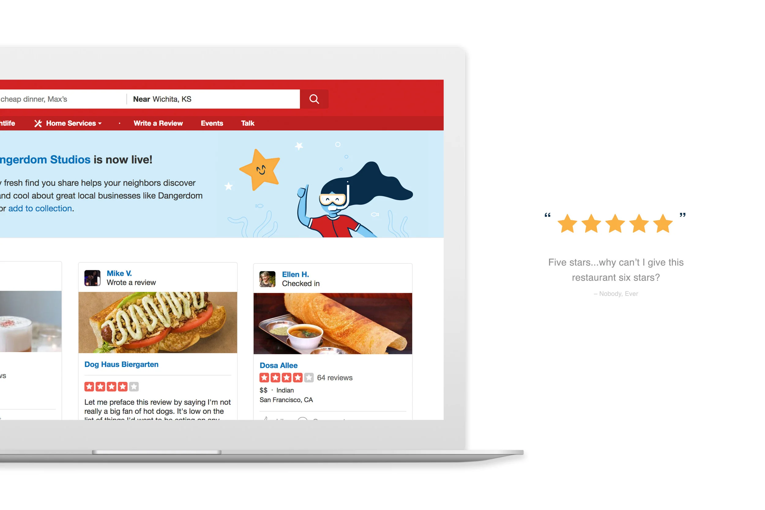
Historically, Yelp has utilized illustration as a part of their core product and brand since its very early days. And while it was met with some degree of success nobody had ever spent time asking what was working, what wasn’t and how to best leverage the power of illustration to further connect their users and their brand.
I spent time reviewing, sourcing and documenting the illustration within their products as well as identifying consistent elements that we could build from when thinking about the future of illustration at Yelp. After some initial explorations we identified a style that was more professional while still retaining the whimsical nature of the company.
EVOLVING THE STYLE
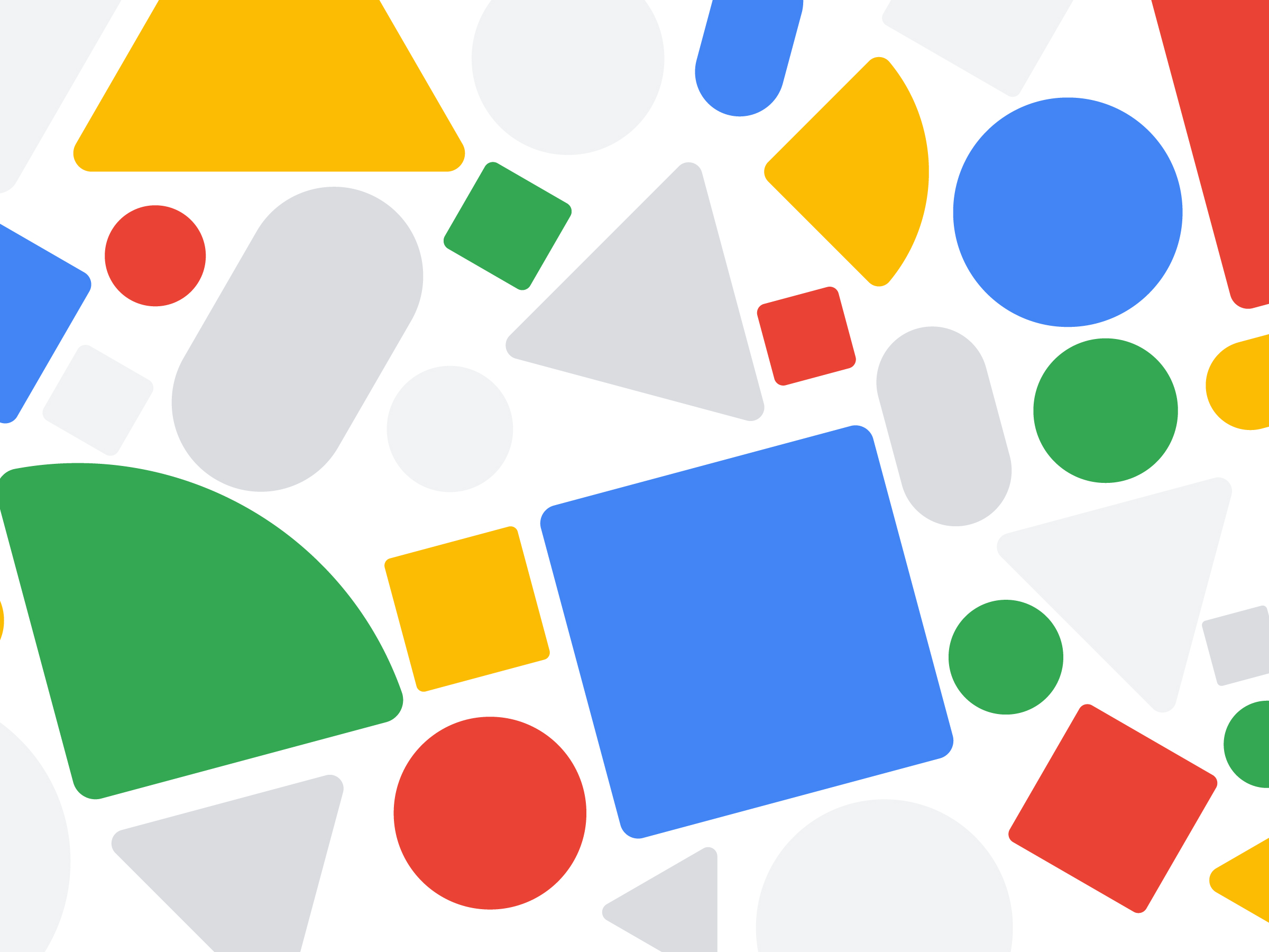
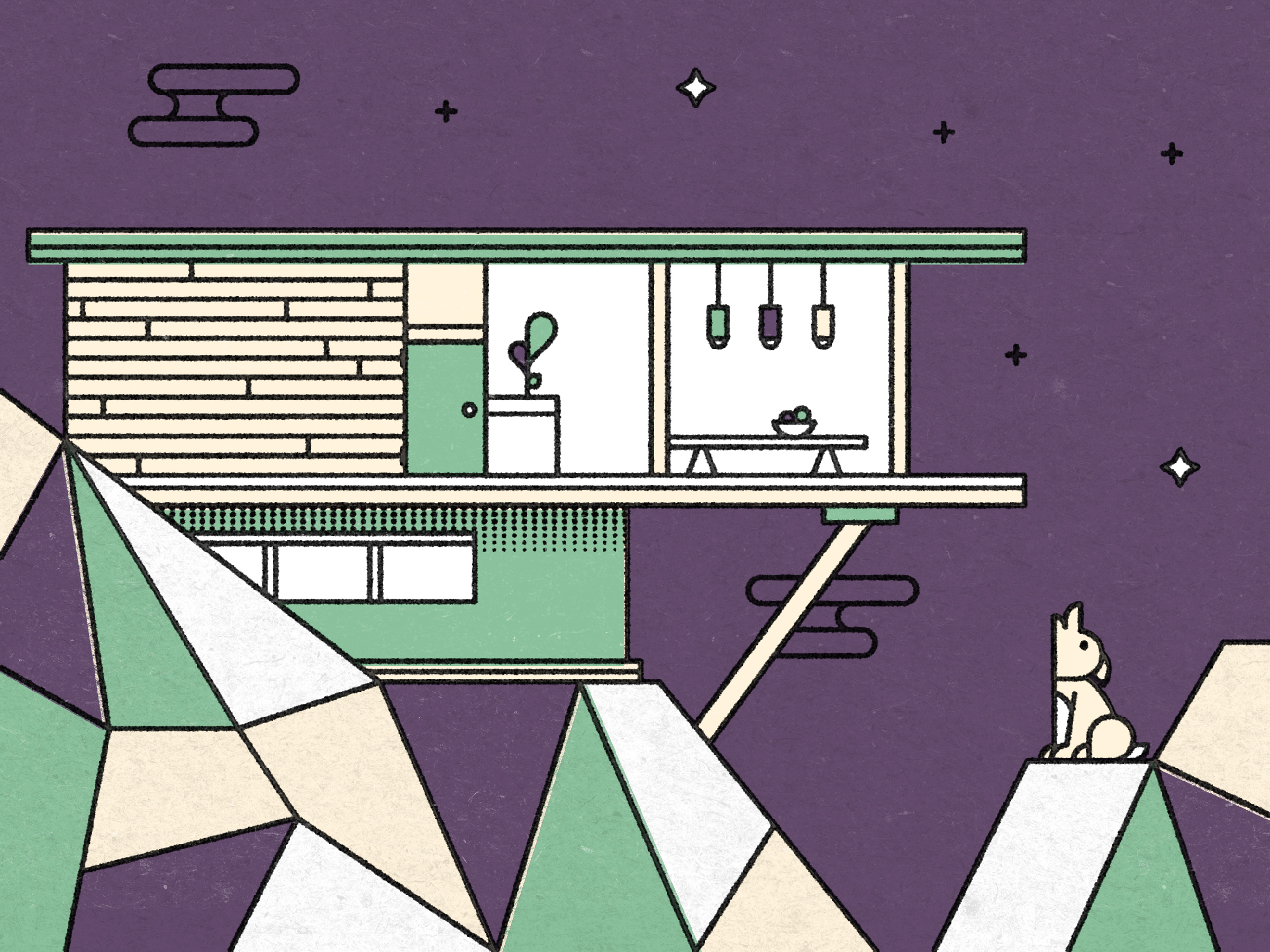
The style built upon the bright color palette and dark linear elements that were contained in the majority of their past illustrations and combined them with a more refined approach to concept development and a more contemporary aesthetic style.
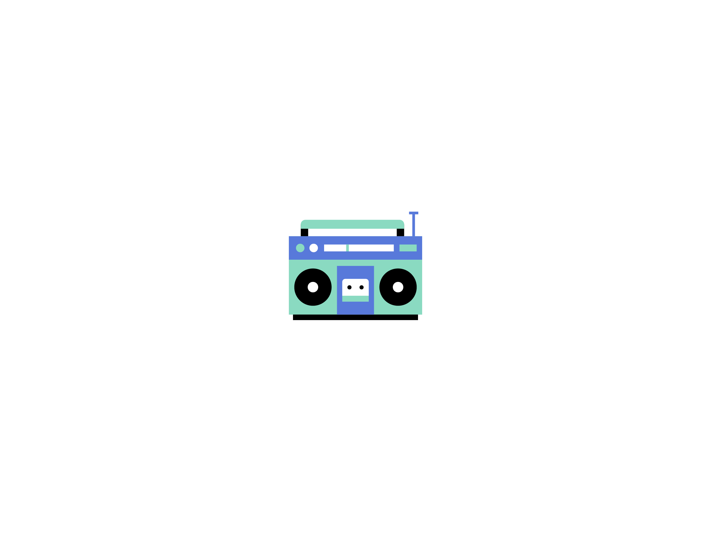
Through a wide variety of style explorations we tested hand drawn line work, pastel color palettes and tactile textures. All of which were discarded in favor of bold colors and precision vectors which felt both whimsical and defined.

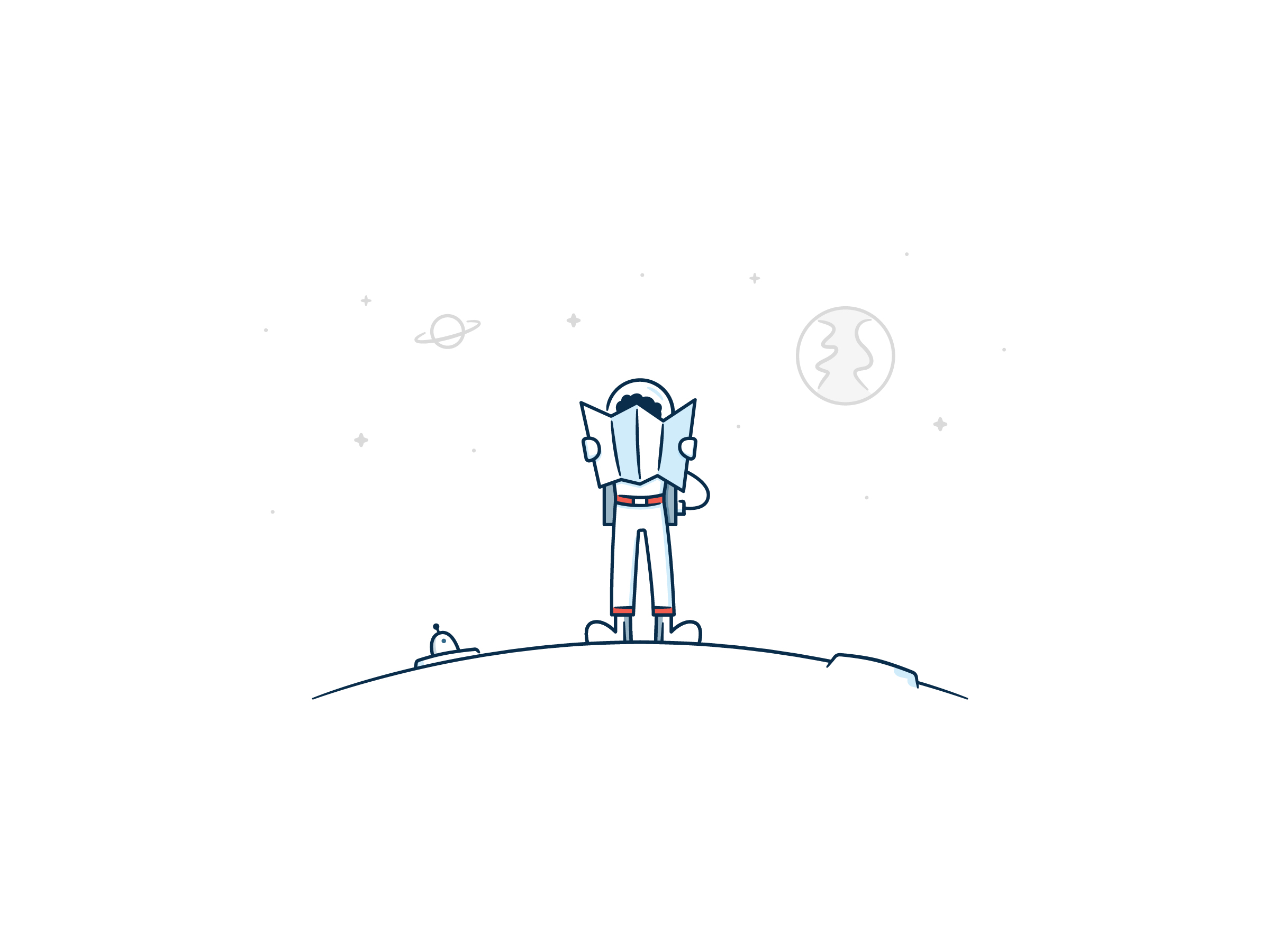
Tiny block people are so cute!…But not good for small screens.


ADDING DEFINITION
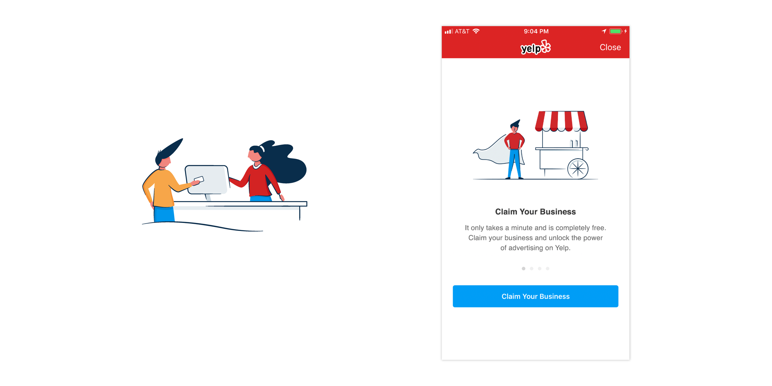
I then built out the details of the style by creating illustrations for use in several of their core products. Many of these revolved around empty or error states, which are a prime location for illustration to both bring clarity to a situation while assuring the user that things are in fact still okay.
The defined aesthetic style allowed for us to keep the brand connected across different products while still allowing for a range of nuances that catered to specific audiences. Above are three illustrations for error states for the Yelp for Business product, below are the same error states with a different, more whimsical approach developed for the core consumer app.
Both sets of illustrations were for the same instances of Lost Connection, Something is Wrong and We Can’t Locate You.


PROVIDING GUIDANCE
I then built out guidelines and specifications for the illustration style and shared it among the product and marketing teams so that additional illustrators and designers could keep the brand consistent throughout all of the materials that Yelp produced. The guidelines reference both the specifics of the aesthetic style as well as the nuances in tone and content of the illustrations.