
PIXEL + CHROMEBOOK
I worked with both the Pixel and Chromebook teams to support the launch of Google’s new handheld device and operating system. In order to support communications across many different devices we established and developed an illustration style that was simple, clear and delightful.
Knowing that one of the core elements we would need were representations of devices we started there by exploring specific aesthetics of how they would be portrayed. We needed to balance a level of abstraction with reality in order to stay both neutral and recognizable.

device specifications
Once we had settled on a style I built out the specifics for each device type including the Pixel, Chromebook, Tablet and several others. This made sure that across all of the different devices made by different manufacturers there was always a consistency that people could recognize.

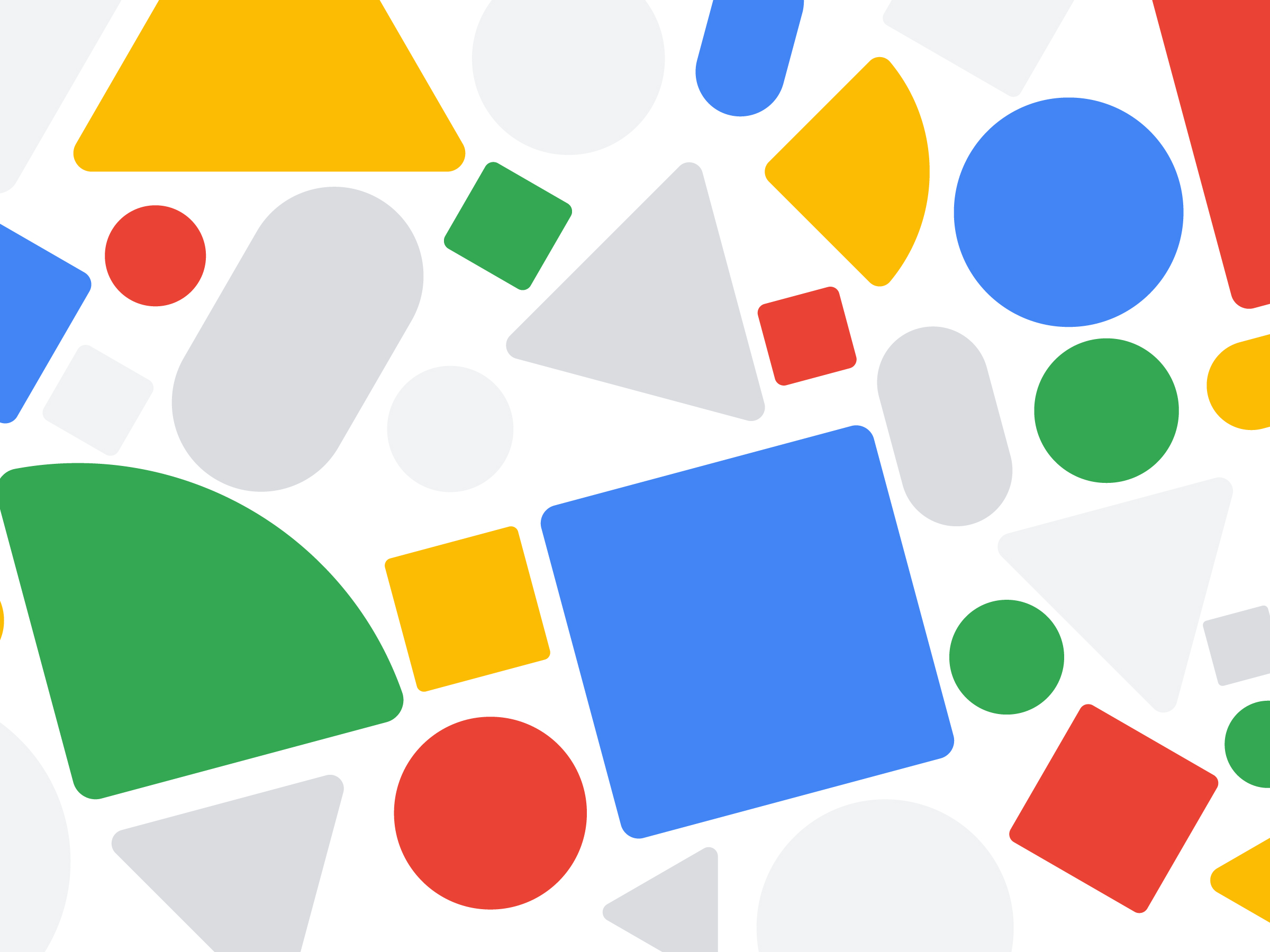
introducing a style
Once the devices had been created we started to explore specific screens and how the style would translate to broader concepts as well as specific directions. One key piece was the introductory animation. We went through many different concepts and I provided both the visuals and animation boards.

adding definition
As the style and implementations began expanding we quickly worked to establish some guiding principles that would increase the consistency across the many different illustrations that were needed. We made the decision to keep all illustrations within a specific sized circle, then specified line weights and a color palette. A core concept connecting the illustrations was our use of geometric shapes throughout and so early on we defined what shapes would be used, scale, corner rounds and other details to ensure they all felt similar.
expanding its reach
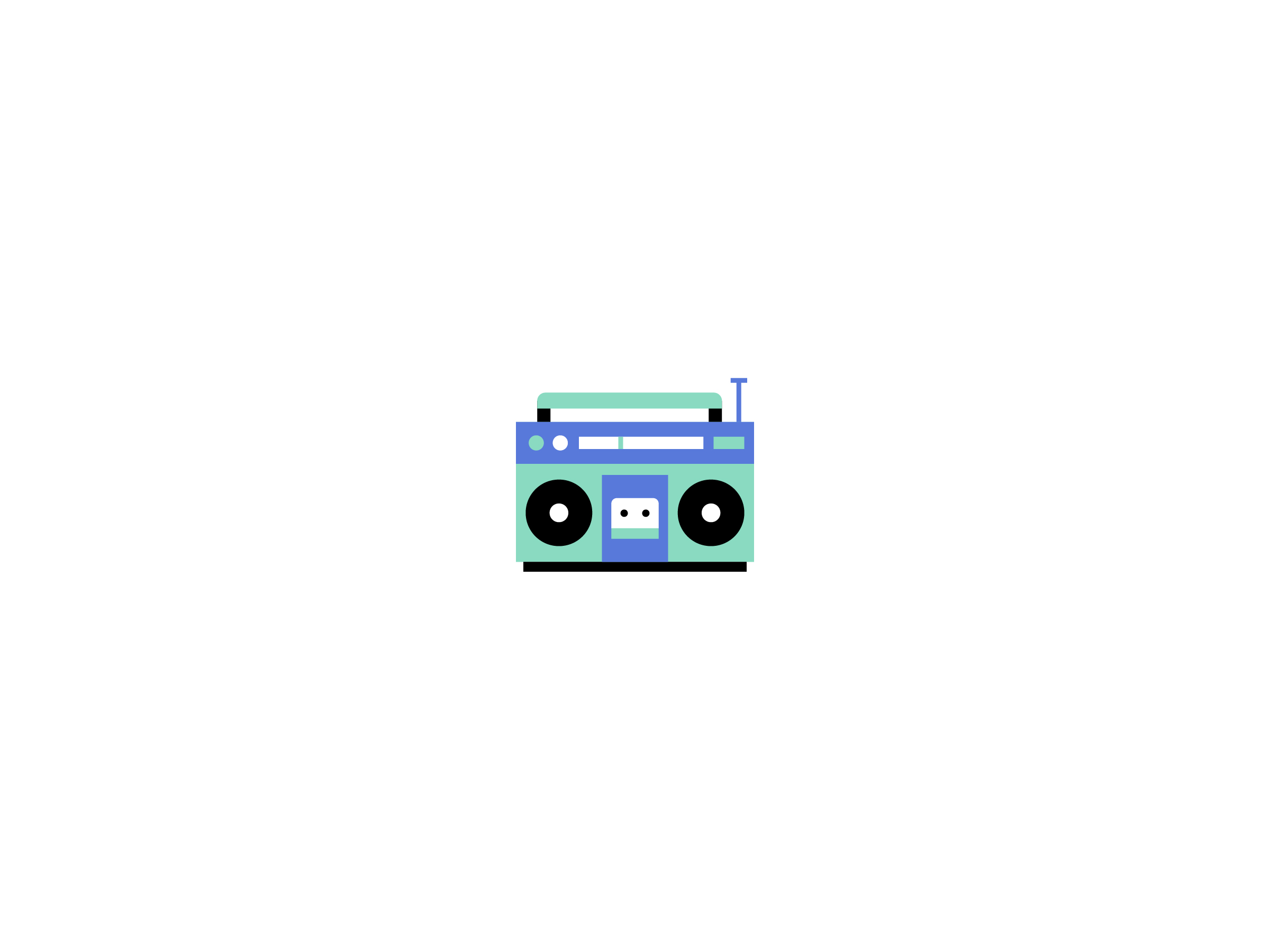
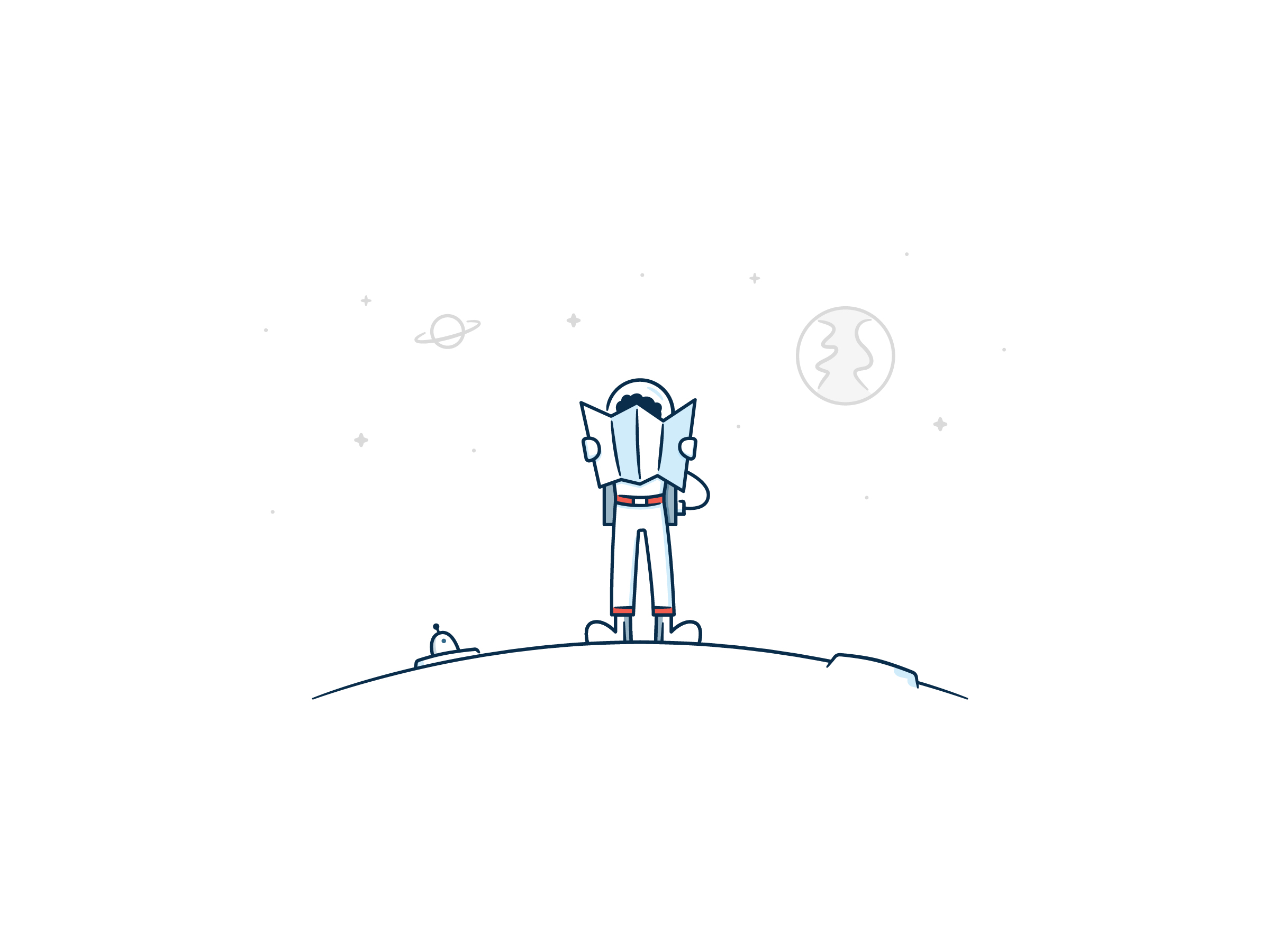
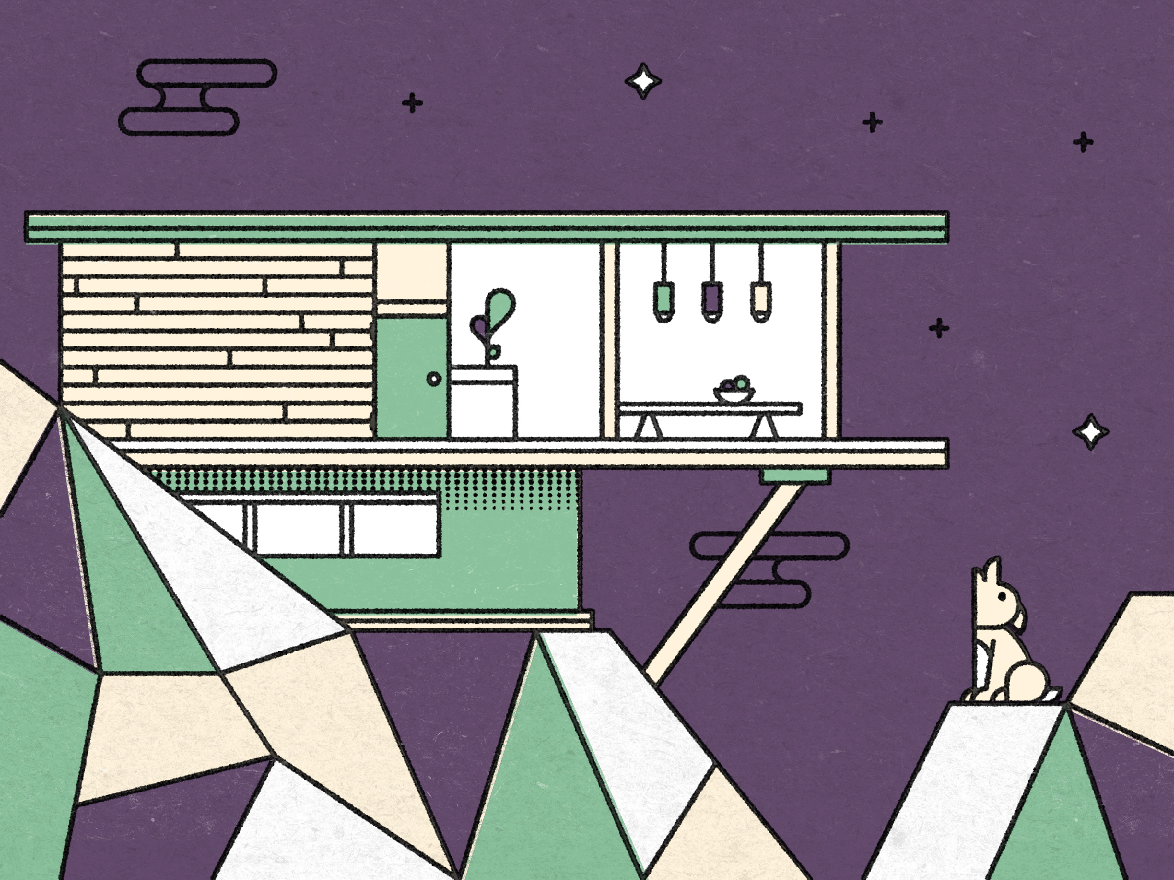
After we had the core elements of the style I continued to develop multiple illustrations across many different contexts, occasionally adding definition to our style where needed for specific instances such as a screen about optimizing for color blindness which needed more colors than our core palette allowed for or how exactly hands were rendered in places we needed to be very descriptive about device usage.

A sample of three different illustration screen.
coming full circle
For the initial definition we focused the majority of our time on specific implementations for the Pixel, knowing that we would mirror the experiences over to the Chromebook where applicable and occasionally testing key instances on both devices. Developing each illustration for a wider screen and different UI proved challenging but the foundation built through the style specifics made the translation between devices very smooth overall.